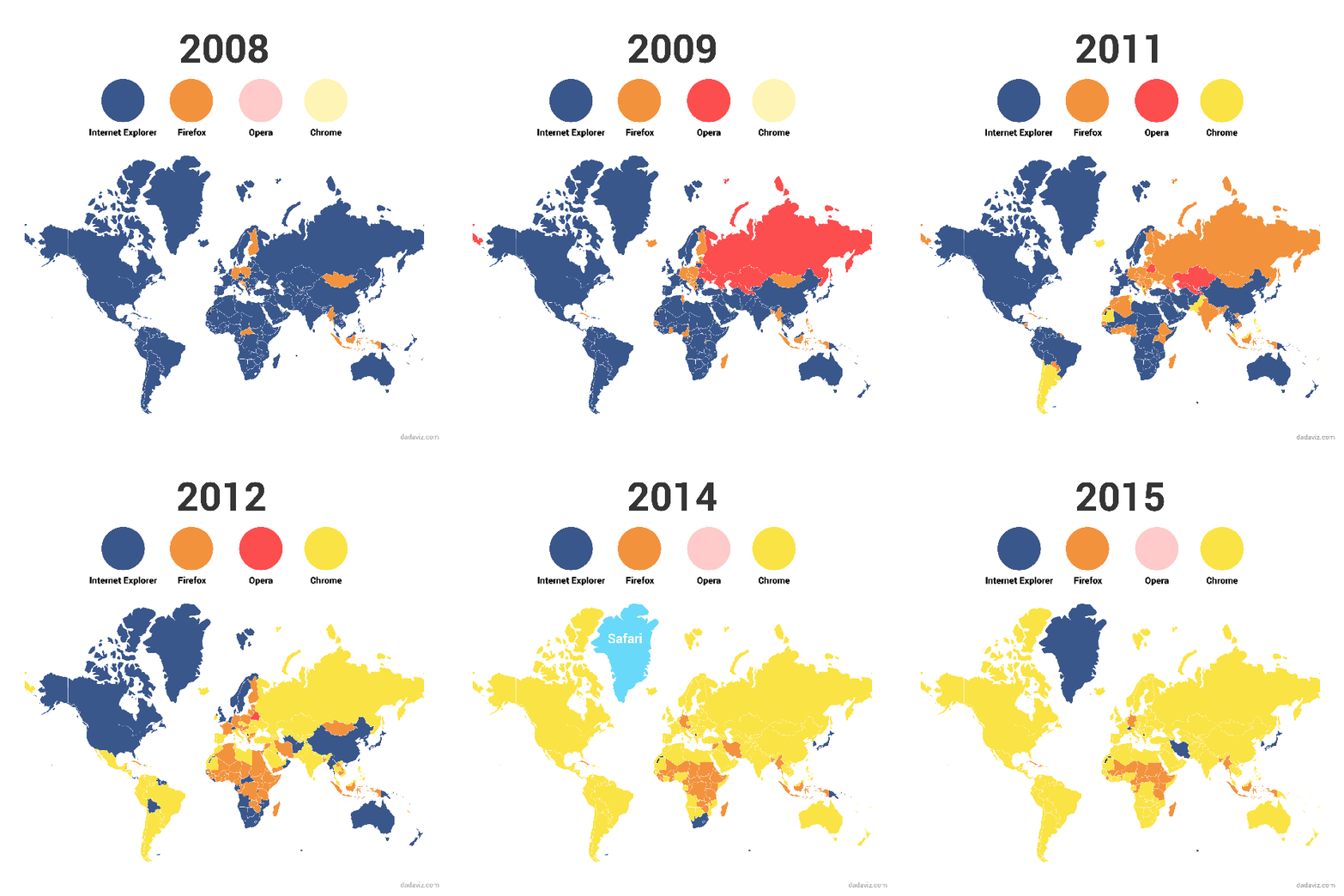
The Internet Explorer exists in Windows 10, but Microsoft Edge is a deserving and powerful replacement. Using the data of web tracker Stat Counter, Judy Sieradzki has made a cool visualization showing shifting trends of web browser usage.
This world hasn’t been a nice place for Microsoft’s humble Internet Explorer and it has become a meme. You might remember a time when web browsing was synonymous with running the Internet Explorer. With time, the world said goodbye to this web browser and just like the most things, people moved on.
Based upon the data of most popular desktop and tablet browser of the year,Jody Sieradzki made a nice colorful visualization of how people changed their preferences and ditched the Internet Explorer.
This map doesn’t just show how people stopped using the Internet Explorer, but also how popular the other web browsers are. In the visualization below, you can see the shifting trends favoring a world with Chrome and Firefox dominance.
Out of the whole, there are some interesting patterns to observe. For example, Opera has gained supremacy in Russia and former USSR about six years ago, while Mozilla’s open source browser Firefox had a party across Africa and Asia in 2011 and 2012.
Take a look below:

Fun fact: In 2014, Safari won the number one title in Greenland as the two people living there decided to give it a try. Just a short little experiment.
Which web browser do you prefer? Tell us in comments below.
VIA: Fossbytes
0 comments:
Post a Comment
Don't Forget to Share and Comment